Interface Design for a Thumb, a Small Screen and a Bad Connection
Mobile design is not layout at a narrower width. It is reach, platform convention, the six versions of every screen, and asking for permissions in an order that does not get you refused. Design is part of every build we do, never a separate quote.
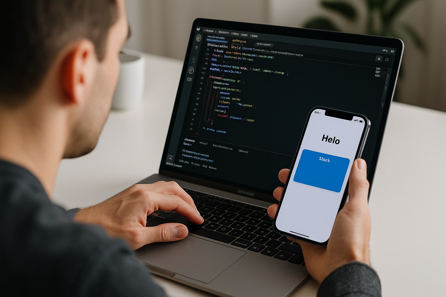
Most People Use a Phone With One Hand and Half Their Attention
Hold a phone the way people actually hold one — in one hand, thumb anchored at the bottom corner — and a sweep of that thumb covers the lower half of the screen comfortably, the middle with a stretch, and the top corner opposite the thumb barely at all. Phones have grown; thumbs have not.
That single fact decides more layout than any style guide. Primary actions go low and wide. Destructive actions go somewhere a thumb does not land by accident. Anything you expect someone to tap forty times a day goes in the easy zone, and the rarely-used settings icon can live in the awkward top corner precisely because it is rare.
- Primary action anchored to the bottom, not floating in the middle
- Tap targets sized for a thumb, with space between them
- Destructive controls kept out of the accidental-swipe path
- No gesture that is the only way to do something important
Where iOS and Android Genuinely Differ — and Where They Do Not
The differences are real but they are a short list. Most of the design is shared; pretending the platforms are identical is what makes an app feel like a website in a wrapper.
| Thing | iOS expectation | Android expectation |
|---|---|---|
| Top-level navigation | A tab bar pinned at the bottom, usually three to five items, always visible | A bottom navigation bar for a few destinations, or a navigation drawer when there are many |
| Going back | A back control at the top left plus an edge swipe from the left; there is no hardware back | A system back gesture or button that works everywhere and must always do something sensible |
| Back at the root | Nothing to go back to; the app simply stays put | Back at the first screen leaves the app, so a confirm-to-exit on a half-finished form matters |
| Secondary actions | An action sheet sliding up from the bottom | A bottom sheet, or an overflow menu behind the three-dot control |
| Confirmations | Alert with the cancel and confirm buttons in the platform order people already expect | A dialog with text buttons, ordered the way the platform orders them |
| Typography | The system typeface with its own default sizes and weights | A different system typeface, different defaults, different rhythm at the same nominal size |
| Pickers and share | The native date, time and share components, which users recognise instantly | The native equivalents, which look nothing like the iOS ones and should not be made to |
| Feedback | Haptics used sparingly for confirmation | Haptics plus, where it fits, a short snackbar with an undo action |
A working summary, not a specification. Both platforms update their guidance regularly and we check the current version at design time rather than relying on a memory of it.
What Stays Identical
Information architecture, the order of steps in a task, wording, brand, illustration, iconography style, spacing scale and the colour system. If a feature works differently on the two platforms, that is a decision someone made by accident.
The Third Platform Trap
The worst outcome is an app that follows neither convention — a custom back arrow that fights the system gesture, a drawer on iOS, a hamburger where a tab bar belongs. It feels foreign on both phones and nobody can say why. Cross-platform tooling makes this easy to do by accident, which is exactly why we design the differences in on purpose.
Every Screen Has Six Versions, and Four of Them Decide Your Rating
The full, happy version is the one everybody draws. It is also the one your users see least often in their first week.
Empty
What a brand new account sees. Not a shrug and a grey icon — a sentence explaining what goes here and a single button that creates the first one. This is the most-viewed screen in your app on day one and it is usually an afterthought.
Loading
A skeleton in the shape of the content that is coming, so the layout does not jump when it arrives. Spinners are honest about waiting; skeletons are honest about waiting and tell you what for. For anything past a few seconds, a line of text saying what is happening.
Error
What went wrong in plain words, whether the person caused it, and what to press next. An error with no action on it is a dead end, and a dead end on a phone means the app gets closed. Never a raw status code, never the word unexpected.
Offline
The state the web mostly ignores and mobile cannot. What is still readable from the last sync, what is queued, what is genuinely unavailable, and a clear promise about when the queue will go. A form that silently fails when the signal drops is the fastest way to lose a user.
Permission Denied
Someone said no to the camera, or to notifications, or to location. The feature has to keep working in a reduced form or explain calmly how to turn it back on in system settings. On iOS a second prompt is not coming, so this screen is permanent for that user unless they go and change it.
Full
And then the one everybody draws — plus its awkward cousins: one item, a thousand items, a name that is sixty characters long, a price in a currency with no decimals, and a photo that failed to load. We draw those at design time because they always turn up.
Six states across the screens that matter is a day or two of design work. Discovering them during QA is a fortnight of rework and a set of rushed decisions.
The First Ninety Seconds Decide Whether the App Stays Installed
Installs are the easy part. The drop between opening an app for the first time and doing anything useful in it is where most apps lose the majority of the people who bothered to download them.
Show, Do Not Sell
The first screen does something rather than explaining that the app will. Carousels of three illustrated promises are a habit, not a mechanism; most people swipe past them without reading and remember nothing.
Value Before Account
Let someone browse, search, calculate or preview without signing in. The account comes at the moment it earns its keep: saving, syncing, paying, sharing. That is also the moment the person has a reason to finish it.
Shorten the Wall
If an identity genuinely is required, cut the form to what you truly need now. Ask for the rest later, in context. Offer the platform sign-in options users already trust, and honour the platform rules about which ones must be offered together.
Land Them Somewhere
After sign-up, do not dump someone on an empty home screen. Carry them into the thing they came for, including when they arrived from a link or an ad and had to install first — that deep link should survive the install.
The Sign-Up Wall, Bluntly
A registration screen on first launch is the single most expensive design decision in most apps. Somebody who has not yet seen anything has no reason to type an email address, and once they have closed the app the re-open rate is small. We have no interest in pretending otherwise to make a stakeholder comfortable: if the brief starts with a mandatory sign-up on launch, we will push back, show you the alternative flow, and let you decide with the trade-off on the table.
Ask for the Camera at the Moment Somebody Wants to Take a Photo
The system permission dialog is the one piece of your app you do not control, cannot restyle, and effectively get one shot at.
Prime It First
Before the system prompt appears, a screen of your own explains what the permission is for and what the person gets from it, with a way to decline that does not burn the system prompt. Only if they say yes to your screen do you show the real one. A refusal on your screen is recoverable; a refusal on the system screen usually is not.
Never on Launch
A permission prompt fired in the first five seconds, before anything has happened, gets declined and deserves to be. Notifications are the worst offender. Ask after the person has done the thing that a notification would be about — placed the order, followed the thread, started the timer.
Ask for the Smaller Thing
Both platforms now let people grant less than you asked for: approximate location instead of precise, location only while the app is open, a few selected photos instead of the whole library. Your design has to work with the reduced grant rather than nagging, and the purpose strings shown in the dialog have to describe a real use a reviewer would accept.
Design the No
What does the feature look like for someone who declined? Manual entry instead of the scanner, a typed postcode instead of the map, an in-app inbox instead of push. If the answer is a broken screen or a loop back to the same request, the design is not finished.
Permission behaviour differs between the platforms and changes with OS releases. We design the priming flow so it holds regardless of whether a second system prompt is possible on a given version.
Dark Mode, Big Text, Notches and the Parts of the Screen You Do Not Own
Four things that are cheap to design in from the start and expensive to retrofit after the visual design is signed off.
Dark Mode Is a Second Design, Not an Inversion
- Pure black backgrounds with pure white text are harsh; near-black surfaces with softened text read better
- Depth stops coming from shadows and starts coming from surface lightness, so the elevation scale has to be redrawn
- Brand colours that pass contrast on white frequently fail on dark and need a second tint
- Photography, illustration, charts, maps and screenshots all need a dark variant or a container that keeps them legible
- It follows the system setting by default, with an in-app override for people who want the opposite
Dynamic Type and Accessibility
- A large share of people run their phone at a larger text size than the default, and many run it much larger
- Layouts reflow and wrap at those sizes rather than truncating with an ellipsis or clipping a button label
- Every control has a label a screen reader can announce, and the reading order follows the visual order
- Contrast checked against the values the platforms themselves publish, including in bright outdoor light
- Colour never the only carrier of meaning; state is also shape, icon or text
- Motion respects the reduce-motion setting, because for some people it is a nausea trigger, not a preference
Safe Areas, Cutouts and Gesture Bars
- The strip behind the status bar and the camera cutout belongs to the system, not to your header
- The home indicator or gesture bar sits over the bottom of the screen, which is exactly where you put the primary button
- An edge-swipe gesture near the screen border will be taken by the system before your control sees it
- The keyboard covers up to half the display, so a form has to scroll the focused field into view and keep the submit button reachable
- Rotation, split screen, tablets and folding devices change the width mid-session rather than at launch
Performance Is a Design Decision
- A hero image at full resolution is an app that takes four seconds to show its first screen on an older handset
- Custom fonts, animation frameworks and icon sets all land in the download size a user sees in the store
- Long lists need a design that works while only part of it is loaded, not one that assumes everything is present
- Anything that keeps the screen awake, polls, or animates continuously shows up in the battery screen with your name on it
These same conditions are what the device QA pass tests against later: real handsets, largest text size, dark mode, airplane mode, permissions declined.
A Version You Can Tap Through Before Anybody Writes Code
Every project gets a clickable prototype on a real phone. Changing your mind here costs an afternoon; changing it in week nine costs a sprint and a re-test.
Sign-Off Settles
What Becomes Fixed
- The screen inventory — how many screens exist and what each is for
- Navigation structure and the route through each task
- Which states each screen has to handle
- Where permissions are asked for and what happens on refusal
- The component set and the spacing, type and colour scale behind it
- The build estimate, which is calculated from all of the above
Sign-Off Does Not Settle
What a Prototype Cannot Tell You
- Whether it feels fast. A prototype has no network, no cold start and no thermal throttling
- Whether the animations survive on a mid-range Android from three years ago
- Whether people will grant the permissions, which only real users answer
- Whether your content fits. Real names, real prices and real photos break layouts that placeholder text never does
- Whether store review is happy with a flow, particularly around accounts, payments and data
- Whether anyone wants it. A prototype tests comprehension, not demand
We say this out loud at sign-off because the phrase “but we approved the design” usually appears in week ten of a project where nobody was told what approval covered. Design settles structure. The build settles feel, and only real devices settle performance.
What You Actually Receive
Flows and Screen Map
Every task drawn end to end, including the branches where something fails, so the screen count is a fact rather than a guess.
Designed Screens, All States
Both platforms where they differ, at the default text size and at a large accessibility size, in light and dark.
Clickable Prototype
A link that runs on your own phone, not a PDF. Comments left on the screens themselves rather than scattered through email.
Component Library
Buttons, fields, sheets, cards and list rows with their pressed, disabled, focused and error states drawn once and reused.
Tokens and Assets
Named type, spacing and colour values, icons and images exported at the densities each platform expects, ready for the build.
Editable Source Files
Yours, handed over at the end whether or not we go on to build it. Nothing is held back as leverage.
Design Questions We Get Asked
Is mobile design just a website design at a narrower width?
No, and treating it that way is the most common reason an app feels wrong without anyone being able to say why. A phone is held in one hand, used in short bursts, interrupted constantly, and operated with a thumb that can only comfortably reach part of the screen. It has a system back gesture, a keyboard that covers half the display, a cutout at the top, a status bar you do not control, and permission prompts that realistically get one chance. None of that exists on a desktop page. We design for the hand and the interruption first and the visual layer second.
Do iOS and Android need two separate designs?
Not two separate designs, but one design with the platform differences decided deliberately rather than ignored. Structure, flows, copy and brand stay identical. What changes is a short and specific list: where the primary navigation sits, how back behaves, which sheet and dialog patterns are used, the system typefaces and their default sizes, the share and date pickers, and where the destructive button sits in a confirmation. That is usually a handful of screens redrawn, not a second project.
Why do you draw empty, loading, error and offline versions of every screen?
Because on a phone those are not edge cases, they are the normal first experience. A new user opens an app with nothing in it. Someone on a train loses signal halfway through a form. A request that takes four hundred milliseconds on your office network takes six seconds in an underground car park. If those states are not drawn they get invented during the build by whoever is closest to the deadline, and they are where the one-star reviews come from. Drawing them costs a few days in design and saves weeks of patching afterwards.
Can we put the sign-up screen first so we capture everyone who installs?
You can, and you will capture far fewer people than you expect. A sign-up wall on first launch asks for commitment before the app has shown anyone why it is worth the effort, and a large share of installs stop there and never come back. The pattern that works is to let someone see or do the core thing first, then ask for an account at the moment it becomes necessary — to save something, to sync it across devices, or to pay. If the app genuinely cannot function without an identity we shorten the wall rather than remove it, and put the reason to sign up on the same screen.
What does signing off the prototype actually commit us to?
It fixes the screen inventory, the navigation structure, the route through each task and the states every screen has to handle. The build estimate is calculated from exactly those things, so changing them afterwards changes the estimate. It does not commit you to final copy, exact colours, icon style, illustration or the contents of any list — those stay adjustable well into the build at little or no cost. We say which side of that line a change falls on before anyone starts arguing about it.
We already have screens from a designer. Will you build from those?
Often yes. We review what exists against the things that are usually missing rather than wrong: the non-happy-path states, the platform navigation differences, safe areas and keyboard behaviour, what the layout does at the largest accessibility text size, and whether the tap targets survive contact with an actual thumb. You get that review in writing with the gaps listed and sized. If the gaps are small your designer closes them and we build. If the structure itself does not work on a phone we say so rather than building it and watching it fail in device testing.
Where Design Sits in the Rest of the Work
MVP App Development
Design is where an MVP gets cut down to something that can actually ship. Fewer screens, decided on purpose.
Learn moreApp Redesign & Rebuild
Restyling an app that already has users is a different problem. It is staged so the people you have do not leave.
Learn moreTesting & QA
Where the designed states get checked on real handsets with the signal off and the text size turned up.
Learn moreSee the App Before It Is Built
Send us the idea or the screens you already have. You get a scope, a screen count and a cost range back within two business days.